W3C的一片好文
9.1
This chapter and the next describe the : how user agents process the for visual .
In the visual formatting model, each element in the document tree generates zero or more boxes according to the . The layout of these boxes is governed by:
- and .
- (normal flow, float, and absolute positioning).
- relationships between elements in the
- external information (e.g., viewport size, dimensions of images, etc.).
The properties defined in this chapter and the next apply to both and . However, the meanings of the vary when applied to paged media (see the for details).
The visual formatting model does not specify all aspects of formatting (e.g., it does not specify a letter-spacing algorithm). may behave differently for those formatting issues not covered by this specification.
9.1.1
User agents for generally offer users a (a window or other viewing area on the screen) through which users consult a document. User agents may change the document's layout when the viewport is resized (see the).
When the viewport is smaller than the area of the canvas on which the document is rendered, the user agent should offer a scrolling mechanism. There is at most one viewport per , but user agents may render to more than one canvas (i.e., provide different views of the same document).
9.1.2
In CSS 2.1, many box positions and sizes are calculated with respect to the edges of a rectangular box called a . In general, generated boxes act as containing blocks for descendant boxes; we say that a box "establishes" the containing block for its descendants. The phrase "a box's containing block" means "the containing block in which the box lives," not the one it generates.
Each box is given a position with respect to its containing block, but it is not confined by this containing block; it may .
The of how a containing block's dimensions are calculated are described in the .
9.2
The following sections describe the types of boxes that may be generated in CSS 2.1. A box's type affects, in part, its behavior in the visual formatting model.The property, described below, specifies a box's type.
9.2.1
are those elements of the source document that are formatted visually as blocks (e.g., paragraphs). The following values of the property make an element block-level: 'block', 'list-item', and 'table'.
are boxes that participate in a Each block-level element generates a that contains descendant boxes and generated content and is also the box involved in any positioning scheme. Some block-level elements may generate additional boxes in addition to the principal box: 'list-item' elements. These additional boxes are placed with respect to the principal box.
Except for table boxes, which are described in a later chapter, and replaced elements, a block-level box is also a block container box. A either contains only block-level boxes or establishes an inline formatting context and thus contains only inline-level boxes. Not all block container boxes are block-level boxes: non-replaced inline blocks and non-replaced table cells are block containers but not block-level boxes. Block-level boxes that are also block containers are called .
The three terms "block-level box," "block container box," and "block box" are sometimes abbreviated as "block" where unambiguous.
9.2.1.1
In a document like this:
Some textMore text
(and assuming the DIV and the P both have 'display: block'), the DIV appears to have both inline content and block content. To make it easier to define the formatting, we assume that there is an around "Some text".
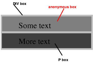
Diagram showing the three boxes, of which one is anonymous, for the example above.
In other words: if a block container box (such as that generated for the DIV above) has a block-level box inside it (such as the P above), then we force it to have only block-level boxes inside it.
When an inline box contains an in-flow block-level box, the inline box (and its inline ancestors within the same line box) are broken around the block-level box (and any block-level siblings that are consecutive or separated only by collapsible whitespace and/or out-of-flow elements), splitting the inline box into two boxes (even if either side is empty), one on each side of the block-level box(es). The line boxes before the break and after the break are enclosed in anonymous block boxes, and the block-level box becomes a sibling of those anonymous boxes. When such an inline box is affected by relative positioning, any resulting translation also affects the block-level box contained in the inline box.
This model would apply in the following example if the following rules:
p { display: inline }span { display: block } were used with this HTML document:
Anonymous text interrupted by a block This is anonymous text before the SPAN.This is the content of SPAN.This is anonymous text after the SPAN.
The P element contains a chunk (C1) of anonymous text followed by a block-level element followed by another chunk (C2) of anonymous text. The resulting boxes would be a block box representing the BODY, containing an anonymous block box around C1, the SPAN block box, and another anonymous block box around C2.
The properties of anonymous boxes are inherited from the enclosing non-anonymous box (e.g., in the example just below the subsection heading "Anonymous block boxes", the one for DIV). Non-inherited properties have their initial value. For example, the font of the anonymous box is inherited from the DIV, but the margins will be 0.
Properties set on elements that cause anonymous block boxes to be generated still apply to the boxes and content of that element. For example, if a border had been set on the P element in the above example, the border would be drawn around C1 (open at the end of the line) and C2 (open at the start of the line).
Some user agents have implemented borders on inlines containing blocks in other ways, e.g., by wrapping such nested blocks inside "anonymous line boxes" and thus drawing inline borders around such boxes. As CSS1 and CSS2 did not define this behavior, CSS1-only and CSS2-only user agents may implement this alternative model and still claim conformance to this part of CSS 2.1. This does not apply to UAs developed after this specification was released.
Anonymous block boxes are ignored when resolving percentage values that would refer to it: the closest non-anonymous ancestor box is used instead. For example, if the child of the anonymous block box inside the DIV above needs to know the height of its containing block to resolve a percentage height, then it will use the height of the containing block formed by the DIV, not of the anonymous block box.
9.2.2
are those elements of the source document that do not form new blocks of content; the content is distributed in lines (e.g., emphasized pieces of text within a paragraph, inline images, etc.). The following values of the property make an element inline-level: 'inline', 'inline-table', and 'inline-block'. Inline-level elements generate , which are boxes that participate in an inline formatting context.
An is one that is both inline-level and whose contents participate in its containing inline formatting context. A non-replaced element with a 'display' value of 'inline' generates an inline box. Inline-level boxes that are not inline boxes (such as replaced inline-level elements, inline-block elements, and inline-table elements) are called because they participate in their inline formatting context as a single opaque box.
9.2.2.1
Any text that is directly contained inside a block container element (not inside an inline element) must be treated as an anonymous inline element.
In a document with HTML markup like this:
Some emphasized text
the <p> generates a block box, with several inline boxes inside it. The box for "emphasized" is an inline box generated by an inline element (<em>), but the other boxes ("Some" and "text") are inline boxes generated by a block-level element (<p>). The latter are called , because they do not have an associated inline-level element.
Such anonymous inline boxes inherit inheritable properties from their block parent box. Non-inherited properties have their initial value. In the example, the color of the anonymous inline boxes is inherited from the P, but the background is transparent.
White space content that would subsequently be collapsed away according to the property does not generate any anonymous inline boxes.
If it is clear from the context which type of anonymous box is meant, both anonymous inline boxes and anonymous block boxes are simply called anonymous boxes in this specification.
There are more types of anonymous boxes that arise when formatting .
9.2.3
[This section exists so that the section numbers are the same as in previous drafts. is now defined in CSS level 3 (see ).]
9.2.4 property
-
Value:
inline | block | list-item | inline-block | table | inline-table | table-row-group | table-header-group | table-footer-group | table-row | table-column-group | table-column | table-cell | table-caption | none |Initial:
inlineApplies to:
all elementsInherited:
noPercentages:
N/AMedia:
Computed value:
see text
The values of this property have the following meanings:
- This value causes an element to generate a block box .
- This value causes an element to generate an inline-level block container . The inside of an inline-block is formatted as a block box, and the element itself is formatted as an atomic inline-level box .
- This value causes an element to generate one or more inline boxes .
- This value causes an element (e .g., LI in HTML) to generate a principal block box and a marker box . For information about lists and examples of list formatting, please consult the section on . none
- causes an element to not appear in the (i .e., in visual media the element generates no boxes and has no effect on layout) .Descendant elements do not generate any boxes either; the element and its content are removed from the formatting structure entirely . This behavior cannot be overridden by setting the property on the descendants .
Please note that a display of 'none' does not create an invisible box; it creates no box at all. CSS includes mechanisms that enable an element to generate boxes in the formatting structure that affect formatting but are not visible themselves.Please consult the section on for details.
, , , , , , , , , and - These values cause an element to behave like a table element (subject to restrictions described in the chapter on ) .
The computed value is the same as the specified value, except for positioned and floating elements (see ) and for the root element. For the root element, the computed value is changed as described in the section on the .
Note that although the of is 'inline', rules in the user agent's may this value. See the for HTML 4 in the appendix.
Here are some examples of the property:
p { display: block }em { display: inline }li { display: list-item } img { display: none } /* Do not display images */ 9.3
In CSS 2.1, a box may be laid out according to three
- . In CSS 2.1, normal flow includes of block-level boxes, of inline-level boxes, and of block-level and inline-level boxes.
- . In the float model, a box is first laid out according to the normal flow, then taken out of the flow and shifted to the left or right as far as possible.Content may flow along the side of a float.
- . In the absolute positioning model, a box is removed from the normal flow entirely (it has no impact on later siblings) and assigned a position with respect to a containing block.
An element is called if it is floated, absolutely positioned, or is the root element. An element is called if it is not out-of-flow. The A is the set consisting of A and all in-flow elements whose nearest out-of-flow ancestor is A.
Note. CSS 2.1's positioning schemes help authors make their documents more accessible by allowing them to avoid mark-up tricks (e.g., invisible images) used for layout effects.
9.3.1 property
The and properties determine which of the CSS 2.1 positioning algorithms is used to calculate the position of a box.
-
Value:
static | relative | absolute | fixed |Initial:
staticApplies to:
all elementsInherited:
noPercentages:
N/AMedia:
Computed value:
as specified
The values of this property have the following meanings:
- static
- The box is a normal box, laid out according to the . The , , , and properties do not apply . relative
- The box's position is calculated according to the (this is called the position in normal flow) . Then the box is offset to its normal position .When a box B is relatively positioned, the position of the following box is calculated as though B were not offset . The effect of 'position:relative' on table-row-group, table-header-group, table-footer-group, table-row, table-column-group, table-column, table-cell, and table-caption elements is undefined . absolute
- The box's position (and possibly size) is specified with the , , , and properties . These properties specify offsets with respect to the box's . Absolutely positioned boxes are taken out of the normal flow .This means they have no impact on the layout of later siblings . Also, though boxes have margins, they do not with any other margins . fixed
- The box's position is calculated according to the 'absolute' model, but in addition, the box is with respect to some reference . As with the 'absolute' model, the box's margins do not collapse with any other margins . In the case of handheld, projection, screen, tty, and tv media types, the box is fixed with respect to the and does not move when scrolled . In the case of the print media type, the box is rendered on every page, and is fixed with respect to the page box, even if the page is seen through a (in the case of a print-preview, for example) . For other media types, the presentation is undefined .Authors may wish to specify 'fixed' in a media-dependent way . For instance, an author may want a box to remain at the top of the on the screen, but not at the top of each printed page . The two specifications may be separated by using an , as in:
@media screen { h1#first { position: fixed } }@media print { h1#first { position: static }}UAs must not paginate the content of fixed boxes. Note that UAs may print invisible content in other ways. See in chapter 13.
User agents may treat position as 'static' on the root element.
9.3.2 : , , ,
An element is said to be if its property has a value other than 'static'. Positioned elements generate positioned boxes, laid out according to four properties:
-
Value:
| | auto |Initial:
autoApplies to:
positioned elementsInherited:
noPercentages:
refer to height of containing blockMedia:
Computed value:
if specified as a length, the corresponding absolute length; if specified as a percentage, the specified value; otherwise, 'auto'.
This property specifies how far an box's top margin edge is offset below the top edge of the box's . For relatively positioned boxes, the offset is with respect to the top edges of the box itself (i.e., the box is given a position in the normal flow, then offset from that position according to these properties).
-
Value:
| | auto |Initial:
autoApplies to:
positioned elementsInherited:
noPercentages:
refer to width of containing blockMedia:
Computed value:
if specified as a length, the corresponding absolute length; if specified as a percentage, the specified value; otherwise, 'auto'.
Like 'top', but specifies how far a box's right margin edge is offset to the left of the right edge of the box's . For relatively positioned boxes, the offset is with respect to the right edge of the box itself.
-
Value:
| | auto |Initial:
autoApplies to:
positioned elementsInherited:
noPercentages:
refer to height of containing blockMedia:
Computed value:
if specified as a length, the corresponding absolute length; if specified as a percentage, the specified value; otherwise, 'auto'.
Like 'top', but specifies how far a box's bottom margin edge is offset above the bottom of the box's . For relatively positioned boxes, the offset is with respect to the bottom edge of the box itself.
-
Value:
| | auto |Initial:
autoApplies to:
positioned elementsInherited:
noPercentages:
refer to width of containing blockMedia:
Computed value:
if specified as a length, the corresponding absolute length; if specified as a percentage, the specified value; otherwise, 'auto'.
Like 'top', but specifies how far a box's left margin edge is offset to the right of the left edge of the box's . For relatively positioned boxes, the offset is with respect to the left edge of the box itself.
The values for the four properties have the following meanings:
- The offset is a fixed distance from the reference edge . Negative values are allowed.
- The offset is a percentage of the containing block's width (for or ) or height (for and ) . Negative values are allowed. auto
- For non-replaced elements, the effect of this value depends on which of related properties have the value 'auto' as well . See the sections on the and of , non-replaced elements for details . For replaced elements, the effect of this value depends only on the intrinsic dimensions of the replaced content . See the sections on the and of absolutely positioned, replaced elements for details .
9.4
Boxes in the normal flow belong to a , which may be block or inline, but not both simultaneously. boxes participate in a context. participate in an context.
9.4.1
Floats, absolutely positioned elements, block containers (such as inline-blocks, table-cells, and table-captions) that are not block boxes, and block boxes with 'overflow' other than 'visible' (except when that value has been propagated to the viewport) establish new block formatting contexts for their contents.
In a block formatting context, boxes are laid out one after the other, vertically, beginning at the top of a containing block. The vertical distance between two sibling boxes is determined by the properties. Vertical margins between adjacent block-level boxes in a block formatting context .
In a block formatting context, each box's left outer edge touches the left edge of the containing block (for right-to-left formatting, right edges touch). This is true even in the presence of floats (although a box's line boxes may shrink due to the floats), unless the box establishes a new block formatting context (in which case the box itself due to the floats).
For information about page breaks in paged media, please consult the section on.
9.4.2
In an inline formatting context, boxes are laid out horizontally, one after the other, beginning at the top of a containing block. Horizontal margins, borders, and padding are respected between these boxes. The boxes may be aligned vertically in different ways: their bottoms or tops may be aligned, or the baselines of text within them may be aligned. The rectangular area that contains the boxes that form a line is called a .
The width of a line box is determined by a and the presence of floats. The height of a line box is determined by the rules given in the section on.
A line box is always tall enough for all of the boxes it contains. However, it may be taller than the tallest box it contains (if, for example, boxes are aligned so that baselines line up). When the height of a box B is less than the height of the line box containing it, the vertical alignment of B within the line box is determined by the property. When several inline-level boxes cannot fit horizontally within a single line box, they are distributed among two or more vertically-stacked line boxes. Thus, a paragraph is a vertical stack of line boxes. Line boxes are stacked with no vertical separation (except as specified elsewhere) and they never overlap.
In general, the left edge of a line box touches the left edge of its containing block and the right edge touches the right edge of its containing block. However, floating boxes may come between the containing block edge and the line box edge. Thus, although line boxes in the same inline formatting context generally have the same width (that of the containing block), they may vary in width if available horizontal space is reduced due to . Line boxes in the same inline formatting context generally vary in height (e.g., one line might contain a tall image while the others contain only text).
When the total width of the inline-level boxes on a line is less than the width of the line box containing them, their horizontal distribution within the line box is determined by the property. If that property has the value 'justify', the user agent may stretch spaces and words in inline boxes (but not inline-table and inline-block boxes) as well.
When an inline box exceeds the width of a line box, it is split into several boxes and these boxes are distributed across several line boxes. If an inline box cannot be split (e.g., if the inline box contains a single character, or language specific word breaking rules disallow a break within the inline box, or if the inline box is affected by a white-space value of nowrap or pre), then the inline box overflows the line box.
When an inline box is split, margins, borders, and padding have no visual effect where the split occurs (or at any split, when there are several).
Inline boxes may also be split into several boxes within the same line box due to.
Line boxes are created as needed to hold inline-level content within an inline formatting context. Line boxes that contain no text, no no inline elements with non-zero margins, padding, or borders, and no other content (such as images, inline blocks or inline tables), and do not end with a preserved newline must be treated as zero-height line boxes for the purposes of determining the positions of any elements inside of them, and must be treated as not existing for any other purpose.
Here is an example of inline box construction. The following paragraph (created by the HTML block-level element P) contains anonymous text interspersed with the elements EM and STRONG:
Several emphasized words appearin this sentence, dear.
The P element generates a block box that contains five inline boxes, three of which are anonymous:
- Anonymous: "Several"
- EM: "emphasized words"
- Anonymous: "appear"
- STRONG: "in this"
- Anonymous: "sentence, dear."
To format the paragraph, the user agent flows the five boxes into line boxes. In this example, the box generated for the P element establishes the containing block for the line boxes. If the containing block is sufficiently wide, all the inline boxes will fit into a single line box:
Several emphasized words appear in this sentence, dear.
If not, the inline boxes will be split up and distributed across several line boxes.The previous paragraph might be split as follows:
Several emphasized words appearin this sentence, dear.or like this:
Several emphasized words appear in this sentence, dear.
In the previous example, the EM box was split into two EM boxes (call them "split1" and "split2"). Margins, borders, padding, or text decorations have no visible effect after split1 or before split2.
Consider the following example:
Example of inline flow on several lines Several emphasized words appear here.
Depending on the width of the P, the boxes may be distributed as follows:

- The margin is inserted before "emphasized" and after "words".
- The padding is inserted before, above, and below "emphasized" and after, above, and below "words". A dashed border is rendered on three sides in each case.
9.4.3
Once a box has been laid out according to the or floated, it may be shifted relative to this position. This is called . Offsetting a box (B1) in this way has no effect on the box (B2) that follows: B2 is given a position as if B1 were not offset and B2 is not re-positioned after B1's offset is applied. This implies that relative positioning may cause boxes to overlap.However, if relative positioning causes an 'overflow:auto' or 'overflow:scroll' box to have overflow, the UA must allow the user to access this content (at its offset position), which, through the creation of scrollbars, may affect layout.
A relatively positioned box keeps its normal flow size, including line breaks and the space originally reserved for it. The section on explains when a relatively positioned box establishes a new containing block.
For relatively positioned elements, 'left' and 'right' move the box(es) horizontally, without changing their size. 'Left' moves the boxes to the right, and 'right' moves them to the left. Since boxes are not split or stretched as a result of 'left' or 'right', the used values are always: left = -right.
If both 'left' and 'right' are 'auto' (their initial values), the used values are '0' (i.e., the boxes stay in their original position).
If 'left' is 'auto', its used value is minus the value of 'right' (i.e., the boxes move to the left by the value of 'right').
If 'right' is specified as 'auto', its used value is minus the value of 'left'.
If neither 'left' nor 'right' is 'auto', the position is over-constrained, and one of them has to be ignored. If the 'direction' property of the containing block is 'ltr', the value of 'left' wins and 'right' becomes -'left'. If 'direction' of the containing block is 'rtl', 'right' wins and 'left' is ignored.
Example. The following three rules are equivalent:
div.a8 { position: relative; direction: ltr; left: -1em; right: auto }div.a8 { position: relative; direction: ltr; left: auto; right: 1em }div.a8 { position: relative; direction: ltr; left: -1em; right: 5em } The 'top' and 'bottom' properties move relatively positioned element(s) up or down without changing their size. 'Top' moves the boxes down, and 'bottom' moves them up. Since boxes are not split or stretched as a result of 'top' or 'bottom', the used values are always: top = -bottom. If both are 'auto', their used values are both '0'. If one of them is 'auto', it becomes the negative of the other.If neither is 'auto', 'bottom' is ignored (i.e., the used value of 'bottom' will be minus the value of 'top').
Note. Dynamic movement of relatively positioned boxes can produce animation effects in scripting environments (see also the property). Although relative positioning may be used as a form of superscripting and subscripting, the line height is not automatically adjusted to take the positioning into consideration. See the description of for more information.
Examples of relative positioning are provided in the section .
9.5
A float is a box that is shifted to the left or right on the current line. The most interesting characteristic of a float (or "floated" or "floating" box) is that content may flow along its side (or be prohibited from doing so by the property).Content flows down the right side of a left-floated box and down the left side of a right-floated box. The following is an introduction to float positioning and content flow; the exact governing float behavior are given in the description of the property.
A floated box is shifted to the left or right until its outer edge touches the containing block edge or the outer edge of another float. If there is a line box, the outer top of the floated box is aligned with the top of the current line box.
If there is not enough horizontal room for the float, it is shifted downward until either it fits or there are no more floats present.
Since a float is not in the flow, non-positioned block boxes created before and after the float box flow vertically as if the float did not exist. However, the current and subsequent line boxes created next to the float are shortened as necessary to make room for the margin box of the float.
A line box is next to a float when there exists a vertical position that satisfies all of these four conditions: (a) at or below the top of the line box, (b) at or above the bottom of the line box, (c) below the top margin edge of the float, and (d) above the bottom margin edge of the float.
Note: this means that floats with zero outer height or negative outer height do not shorten line boxes.
If a shortened line box is too small to contain any content, then the line box is shifted downward (and its width recomputed) until either some content fits or there are no more floats present. Any content in the current line before a floated box is reflowed in the same line on the other side of the float. In other words, if inline-level boxes are placed on the line before a left float is encountered that fits in the remaining line box space, the left float is placed on that line, aligned with the top of the line box, and then the inline-level boxes already on the line are moved accordingly to the right of the float (the right being the other side of the left float) and vice versa for rtl and right floats.
The border box of a table, a block-level replaced element, or an element in the normal flow that establishes a new (such as an element with 'overflow' other than 'visible') must not overlap the margin box of any floats in the same block formatting context as the element itself. If necessary, implementations should clear the said element by placing it below any preceding floats, but may place it adjacent to such floats if there is sufficient space. They may even make the border box of said element narrower than defined by CSS2 does not define when a UA may put said element next to the float or by how much said element may become narrower.
Example. In the following document fragment, the containing block is too narrow to contain the content next to the float, so the content gets moved to below the floats where it is aligned in the line box according to the text-align property.
p { width: 10em; border: solid aqua; }span { float: left; width: 5em; height: 5em; border: solid blue; }... Supercalifragilisticexpialidocious
This fragment might look like this:
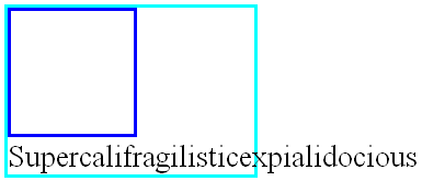
Several floats may be adjacent, and this model also applies to adjacent floats in the same line.
The following rule floats all IMG boxes with class="icon" to the left (and sets the left margin to '0'):
img.icon { float: left; margin-left: 0;} Consider the following HTML source and style sheet:
Float example
Some sample text that has no other...
The IMG box is floated to the left. The content that follows is formatted to the right of the float, starting on the same line as the float. The line boxes to the right of the float are shortened due to the float's presence, but resume their "normal" width (that of the containing block established by the P element) after the float. This document might be formatted as:
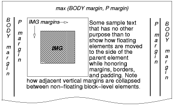
Formatting would have been exactly the same if the document had been:
Some sample text
that has no other...
because the content to the left of the float is displaced by the float and reflowed down its right side.
As stated in , the margins of floating boxes never with margins of adjacent boxes. Thus, in the previous example, vertical margins do not between the P box and the floated IMG box.
The contents of floats are stacked as if floats generated new stacking contexts, except that any positioned elements and elements that actually create new stacking contexts take part in the float's parent stacking context. A float can overlap other boxes in the normal flow (e.g., when a normal flow box next to a float has negative margins). When this happens, floats are rendered in front of non-positioned in-flow blocks, but behind in-flow inlines.
Here is another illustration, showing what happens when a float overlaps borders of elements in the normal flow.
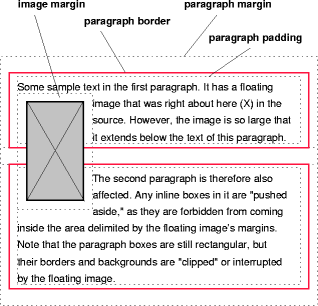
A floating image obscures borders of block boxes it overlaps.
The following example illustrates the use of the property to prevent content from flowing next to a float.
Assuming a rule such as this:
p { clear: left } formatting might look like this:
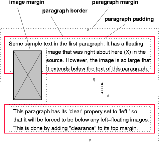
Both paragraphs have set 'clear: left', which causes the second paragraph to be "pushed down" to a position below the float — "clearance" is added above its top margin to accomplish this (see the property).
9.5.1 the property
-
Value:
left | right | none |Initial:
noneApplies to:
all, but seeInherited:
noPercentages:
N/AMedia:
Computed value:
as specified
This property specifies whether a box should float to the left, right, or not at all.It may be set for any element, but only applies to elements that generate boxes that are not . The values of this property have the following meanings:
- left
- The element generates a box that is floated to the left . Content flows on the right side of the box, starting at the top (subject to the property) . right
- Similar to 'left', except the box is floated to the right, and content flows on the left side of the box, starting at the top . none
- The box is not floated .
User agents may treat float as 'none' on the root element.
that govern the behavior of floats:
- The left of a left-floating box may not be to the left of the left edge of its . An analogous rule holds for right-floating elements.
- If the current box is left-floating, and there are any left-floating boxes generated by elements earlier in the source document, then for each such earlier box, either the left of the current box must be to the right of the right of the earlier box, or its top must be lower than the bottom of the earlier box. Analogous rules hold for right-floating boxes.
- The right of a left-floating box may not be to the right of the left of any right-floating box that is next to it. Analogous rules hold for right-floating elements.
- A floating box's may not be higher than the top of its . When the float occurs between two collapsing margins, the float is positioned as if it had an otherwise empty taking part in the flow. The position of such a parent is defined by in the section on margin collapsing.
- The of a floating box may not be higher than the outer top of any or box generated by an element earlier in the source document.
- The of an element's floating box may not be higher than the top of any containing a box generated by an element earlier in the source document.
- A left-floating box that has another left-floating box to its left may not have its right outer edge to the right of its containing block's right edge. (Loosely: a left float may not stick out at the right edge, unless it is already as far to the left as possible.) An analogous rule holds for right-floating elements.
- A floating box must be placed as high as possible.
- A left-floating box must be put as far to the left as possible, a right-floating box as far to the right as possible. A higher position is preferred over one that is further to the left/right.
But in CSS 2.1, if, within the block formatting context, there is an in-flow negative vertical margin such that the float's position is above the position it would be at were all such negative margins set to zero, the position of the float is undefined.
References to other elements in these rules refer only to other elements in the same as the float.
This HTML fragment results in the b floating to the right.
ab
If the P element's width is enough, the a and the b will be side by side. It might look like this:

9.5.2 the property
-
Value:
none | left | right | both |Initial:
noneApplies to:
block-level elementsInherited:
noPercentages:
N/AMedia:
Computed value:
as specified
This property indicates which sides of an element's box(es) may not be adjacent to an earlier floating box. The 'clear' property does not consider floats inside the element itself or in other
Values have the following meanings when applied to non-floating block-level boxes:
- left
- Requires that the top border edge of the box be below the bottom outer edge of any left-floating boxes that resulted from elements earlier in the source document . right
- Requires that the top border edge of the box be below the bottom outer edge of any right-floating boxes that resulted from elements earlier in the source document . both
- Requires that the top border edge of the box be below the bottom outer edge of any right-floating and left-floating boxes that resulted from elements earlier in the source document . none
- No constraint on the box's position with respect to floats .
Values other than 'none' potentially introduce . Clearance inhibits margin collapsing and acts as spacing above the margin-top of an element. It is used to push the element vertically past the float.
Computing the clearance of an element on which 'clear' is set is done by first determining the hypothetical position of the element's top border edge. This position is where the actual top border edge would have been if the element's 'clear' property had been 'none'.
If this hypothetical position of the element's top border edge is not past the relevant floats, then clearance is introduced, and margins collapse according to the rules in 8.3.1.
Then the amount of clearance is set to the greater of:
- The amount necessary to place the border edge of the block even with the bottom outer edge of the lowest float that is to be cleared.
- The amount necessary to place the top border edge of the block at its hypothetical position.
Alternatively, clearance is set exactly to the amount necessary to place the border edge of the block even with the bottom outer edge of the lowest float that is to be cleared.
Note: Both behaviors are allowed pending evaluation of their compatibility with existing Web content. A future CSS specification will require either one or the other.
Note: The clearance can be negative or zero.
Example 1. Assume (for the sake of simplicity), that we have just three boxes, in this order: block B1 with a bottom margin of M1 (B1 has no children and no padding or border), floating block F with a height H, and block B2 with a top margin of M2 (no padding or border, no children). B2 has 'clear' set to 'both'. We also assume B2 is not empty.
Without considering the 'clear' property on B2, we have the situation in the diagram below. The margins of B1 and B2 collapse. Let's say the bottom border edge of B1 is at y = 0, then the top of F is at y = M1, the top border edge of B2 is at y = max(M1,M2), and the bottom of F is at y = M1 + H.
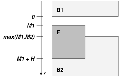
We also assume that B2 is not below F, i.e., we are in the situation described in the spec where we need to add clearance. That means:
max(M1,M2) < M1 + H
We need to compute clearance C twice, C1 and C2, and keep the greater of the two: C = max(C1,C2). The first way is to put the top of B2 flush with the bottom of F, i.e., at y = M1 + H. That means, because the margins no longer collapse with a clearance between them:
bottom of F = top border edge of B2 ⇔
M1 + H = M1 + C1 + M2 ⇔
C1 = M1 + H - M1 - M2
= H - M2
The second computation is to keep the top of B2 where it is, i.e., at y = max(M1,M2). That means:
max(M1,M2) = M1 + C2 + M2 ⇔
C2 = max(M1,M2) - M1 - M2
We assumed that max(M1,M2) < M1 + H, which implies
C2 = max(M1,M2) - M1 - M2 < M1 + H - M1 - M2 = H - M2 ⇒
C2 < H - M2
And, as C1 = H - M2, it follows that
C2 < C1
and hence
C = max(C1,C2) = C1
Example 2. An example of negative clearance is this situation, in which the clearance is -1em. (Assume none of the elements have borders or padding):
First paragraph.
Floating paragraph.
Last paragraph.
Explanation: Without the 'clear', the first and last paragraphs' margins would collapse and the last paragraph's top border edge would be flush with the top of the floating paragraph. But the 'clear' requires the top border edge to be belowthe float, i.e., 2em lower. This means that clearance must be introduced.Accordingly, the margins no longer collapse and the amount of clearance is set so that clearance + margin-top = 2em, i.e., clearance = 2em - margin-top = 2em - 3em = -1em.
When the property is set on floating elements, it results in a modification of the for positioning the float. An extra constraint (#10) is added:
- The top of the float must be below the bottom outer edge of all earlier left-floating boxes (in the case of 'clear: left'), or all earlier right-floating boxes (in the case of 'clear: right'), or both ('clear: both').
Note. This property . Implementations may therefore have supported this property on all elements. In CSS2 and CSS 2.1 the 'clear' property only applies to block-level elements. Therefore authors should only use this property on block-level elements. If an implementation does support clear on inline elements, rather than setting a clearance as explained above, the implementation should force a break and effectively insert one or more empty line boxes (or shifting the new line box downward as described in ) to move the top of the cleared inline's line box to below the respective floating box(es).
9.6
In the absolute positioning model, a box is explicitly offset with respect to its containing block. It is removed from the normal flow entirely (it has no impact on later siblings). An absolutely positioned box establishes a new containing block for normal flow children and absolutely (but not fixed) positioned descendants. However, the contents of an absolutely positioned element do not flow around any other boxes. They may obscure the contents of another box (or be obscured themselves), depending on the of the overlapping boxes.
References in this specification to an (or its box) imply that the element's property has the value 'absolute' or 'fixed'.
9.6.1
Fixed positioning is a subcategory of absolute positioning. The only difference is that for a fixed positioned box, the containing block is established by the. For , fixed boxes do not move when the document is scrolled. In this respect, they are similar to . For , boxes with fixed positions are repeated on every page. This is useful for placing, for instance, a signature at the bottom of each page. Boxes with fixed position that are larger than the page area are clipped. Parts of the fixed position box that are not visible in the initial containing block will not print.
Authors may use fixed positioning to create frame-like presentations. Consider the following frame layout:
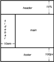
This might be achieved with the following HTML document and style rules:
A frame document with CSS 2.1 ......
9.7
The three properties that affect box generation and layout — , , and — interact as follows:
- If has the value 'none', then and do not apply. In this case, the element generates no box.
- Otherwise, if has the value 'absolute' or 'fixed', the box is absolutely positioned, the computed value of is 'none', and display is set according to the table below. The position of the box will be determined by the ,, and properties and the box's containing block.
- Otherwise, if 'float' has a value other than 'none', the box is floated and 'display' is set according to the table below.
- Otherwise, if the element is the root element, 'display' is set according to the table below, except that it is undefined in CSS 2.1 whether a specified value of 'list-item' becomes a computed value of 'block' or 'list-item'.
- Otherwise, the remaining property values apply as specified.
Specified value
Computed valueinline-table
tableinline, table-row-group, table-column, table-column-group, table-header-group, table-footer-group, table-row, table-cell, table-caption, inline-block
blockothers
same as specified9.8
To illustrate the differences between normal flow, relative positioning, floats, and absolute positioning, we provide a series of examples based on the following HTML:
Comparison of positioning schemes Beginning of body contents. Start of outer contents. Inner contents. End of outer contents. End of body contents.
In this document, we assume the following rules:
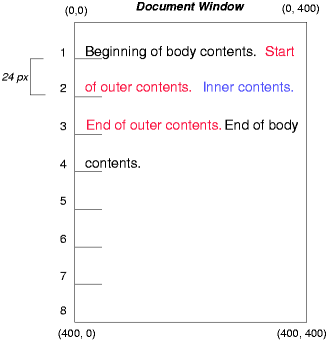
body { display: block; font-size:12px; line-height: 200%; width: 400px; height: 400px }p { display: block }span { display: inline } The final positions of boxes generated by the outer and inner elements vary in each example. In each illustration, the numbers to the left of the illustration indicate the position of the double-spaced (for clarity) lines.
Note. The diagrams in this section are illustrative and not to scale. They are meant to highlight the differences between the various positioning schemes in CSS 2.1, and are not intended to be reference renderings of the examples given.
9.8.1
Consider the following CSS declarations for outer and inner that do not alter the of boxes:
#outer { color: red }#inner { color: blue } The P element contains all inline content: and two SPAN elements. Therefore, all of the content will be laid out in an inline formatting context, within a containing block established by the P element, producing something like:
9.8.2
To see the effect of , we specify:
#outer { position: relative; top: -12px; color: red }#inner { position: relative; top: 12px; color: blue } Text flows normally up to the outer element. The outer text is then flowed into its normal flow position and dimensions at the end of line 1. Then, the inline boxes containing the text (distributed over three lines) are shifted as a unit by '-12px' (upwards).
The contents of inner, as a child of outer, would normally flow immediately after the words "of outer contents" (on line 1.5). However, the inner contents are themselves offset relative to the outer contents by '12px' (downwards), back to their original position on line 2.
Note that the content following outer is not affected by the relative positioning of outer.
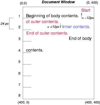
Note also that had the offset of outer been '-24px', the text of outer and the body text would have overlapped.
9.8.3
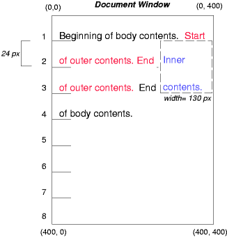
Now consider the effect of the inner element's text to the right by means of the following rules:
#outer { color: red }#inner { float: right; width: 130px; color: blue } Text flows normally up to the inner box, which is pulled out of the flow and floated to the right margin (its has been assigned explicitly). Line boxes to the left of the float are shortened, and the document's remaining text flows into them.
To show the effect of the property, we add a sibling element to the example:
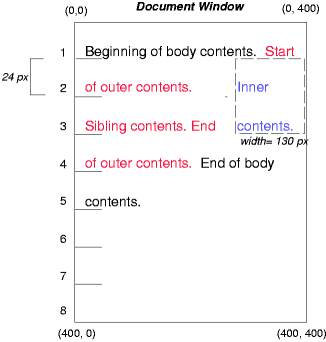
Comparison of positioning schemes II Beginning of body contents. Start of outer contents. Inner contents. Sibling contents. End of outer contents. End of body contents.
The following rules:
#inner { float: right; width: 130px; color: blue }#sibling { color: red } cause the inner box to float to the right as before and the document's remaining text to flow into the vacated space:
However, if the property on the sibling element is set to 'right' (i.e., the generated sibling box will not accept a position next to floating boxes to its right), the sibling content begins to flow below the float:
#inner { float: right; width: 130px; color: blue }#sibling { clear: right; color: red } 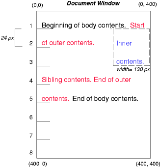
9.8.4
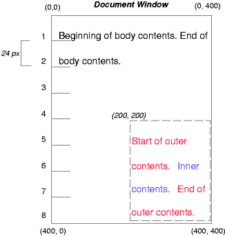
Finally, we consider the effect of . Consider the following CSS declarations for outer and inner:
#outer { position: absolute; top: 200px; left: 200px; width: 200px; color: red;}#inner { color: blue } which cause the top of the outer box to be positioned with respect to its containing block. The containing block for a positioned box is established by the nearest positioned ancestor (or, if none exists, the , as in our example). The top side of the outer box is '200px' below the top of the containing block and the left side is '200px' from the left side. The child box ofouter is flowed normally with respect to its parent.
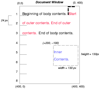
The following example shows an absolutely positioned box that is a child of a relatively positioned box. Although the parent outer box is not actually offset, setting its property to 'relative' means that its box may serve as the containing block for positioned descendants. Since the outer box is an inline box that is split across several lines, the first inline box's top and left edges (depicted by thick dashed lines in the illustration below) serve as references for and offsets.
#outer { position: relative; color: red }#inner { position: absolute; top: 200px; left: -100px; height: 130px; width: 130px; color: blue;} This results in something like the following:
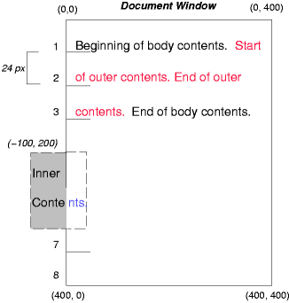
If we do not position the outer box:
#outer { color: red }#inner { position: absolute; top: 200px; left: -100px; height: 130px; width: 130px; color: blue;} the containing block for inner becomes the (in our example). The following illustration shows where the inner box would end up in this case.
Relative and absolute positioning may be used to implement change bars, as shown in the following example. The following fragment:
I used two red hyphens to serve as a change bar. Theywill "float" to the left of the line containing THIS--word.
might result in something like:
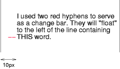
First, the paragraph (whose containing block sides are shown in the illustration) is flowed normally. Then it is offset '10px' from the left edge of the containing block (thus, a right margin of '10px' has been reserved in anticipation of the offset). The two hyphens acting as change bars are taken out of the flow and positioned at the current line (due to 'top: auto'), '-1em' from the left edge of its containing block (established by the P in its final position). The result is that the change bars seem to "float" to the left of the current line.
9.9
9.9.1 : the property
-
Value:
auto | |Initial:
autoApplies to:
positioned elementsInherited:
noPercentages:
N/AMedia:
Computed value:
as specified
For a positioned box, the property specifies:
- The stack level of the box in the current stacking context.
- Whether the box establishes a stacking context.
Values have the following meanings:
- This integer is the stack level of the generated box in the current stacking context . The box also establishes a new stacking context. auto
- The stack level of the generated box in the current stacking context is 0 . The box does not establish a new stacking context unless it is the root element .
In this section, the expression "in front of" means closer to the user as the user faces the screen.
In CSS 2.1, each box has a position in three dimensions. In addition to their horizontal and vertical positions, boxes lie along a "z-axis" and are formatted one on top of the other. Z-axis positions are particularly relevant when boxes overlap visually. This section discusses how boxes may be positioned along the z-axis.
The order in which the rendering tree is painted onto the canvas is described in terms of stacking contexts. Stacking contexts can contain further stacking contexts. A stacking context is atomic from the point of view of its parent stacking context; boxes in other stacking contexts may not come between any of its boxes.
Each box belongs to one . Each positioned box in a given stacking context has an integer , which is its position on the z-axis relative other stack levels within the same stacking context. Boxes with greater stack levels are always formatted in front of boxes with lower stack levels. Boxes may have negative stack levels. Boxes with the same stack level in a stacking context are stacked back-to-front according to document tree order.
The root element forms the root stacking context. Other stacking contexts are generated by any positioned element (including relatively positioned elements) having a computed value of 'z-index' other than 'auto'. Stacking contexts are not necessarily related to containing blocks. In future levels of CSS, other properties may introduce stacking contexts, for example '' .
Within each stacking context, the following layers are painted in back-to-front order:
- the background and borders of the element forming the stacking context.
- the child stacking contexts with negative stack levels (most negative first).
- the in-flow, non-inline-level, non-positioned descendants.
- the non-positioned floats.
- the in-flow, inline-level, non-positioned descendants, including inline tables and inline blocks.
- the child stacking contexts with stack level 0 and the positioned descendants with stack level 0.
- the child stacking contexts with positive stack levels (least positive first).
Within each stacking context, positioned elements with stack level 0 (in layer 6), non-positioned floats (layer 4), inline blocks (layer 5), and inline tables (layer 5), are painted as if those elements themselves generated new stacking contexts, except that their positioned descendants and any would-be child stacking contexts take part in the current stacking context.
This painting order is applied recursively to each stacking context. This description of stacking context painting order constitutes an overview of the detailed normative definition in
In the following example, the stack levels of the boxes (named with their "id" attributes) are: "text2"=0, "image"=1, "text3"=2, and "text1"=3. The "text2" stack level is inherited from the root box. The others are specified with the property.
Z-order positioning
 This text will overlay the butterfly image.This text will be beneath everything.This text will underlay text1, but overlay the butterfly image
This example demonstrates the notion of transparency. The default behavior of the background is to allow boxes behind it to be visible. In the example, each box transparently overlays the boxes below it. This behavior can be overridden by using one of the existing .
9.10 the and properties
user agents that do not support bidirectional text may ignore the and properties described in this section. This exception includes UAs that render right-to-left characters simply because a font on the system contains them but do not support the concept of right-to-left text direction.
The characters in certain scripts are written from right to left. In some documents, in particular those written with the Arabic or Hebrew script, and in some mixed-language contexts, text in a single (visually displayed) block may appear with mixed directionality. This phenomenon is called , or "bidi" for short.
The Unicode standard (, ) defines a complex algorithm for determining the proper directionality of text. The algorithm consists of an implicit part based on character properties, as well as explicit controls for embeddings and overrides. CSS 2.1 relies on this algorithm to achieve proper bidirectional rendering. The and properties allow authors to specify how the elements and attributes of a document language map to this algorithm.
User agents that support bidirectional text must apply the Unicode bidirectional algorithm to every sequence of inline-level boxes uninterrupted by a forced () break or block boundary. This sequence forms the "paragraph" unit in the bidirectional algorithm. The paragraph embedding level is set according to the value of the property of the containing block rather than by the heuristic given in steps P2 and P3 of the Unicode algorithm.
Because the directionality of a text depends on the structure and semantics of the document language, these properties should in most cases be used only by designers of document type descriptions (DTDs), or authors of special documents. If a default style sheet specifies these properties, authors and users should not specify rules to override them.
The HTML 4 specification ([HTML4], section 8.2) defines bidirectionality behavior for HTML elements. The style sheet rules that would achieve the bidi behavior specified in are given in . The HTML 4 specification also contains more information on bidirectionality issues.
-
Value:
ltr | rtl |Initial:
ltrApplies to:
all elements, but see proseInherited:
yesPercentages:
N/AMedia:
Computed value:
as specified
This property specifies the base writing direction of blocks and the direction of embeddings and overrides (see ) for the Unicode bidirectional algorithm. In addition, it specifies such things as the direction of column layout, the direction of horizontal , the position of an incomplete last line in a block in case of 'text-align: justify'.
Values for this property have the following meanings:
- ltr
- Left-to-right direction . rtl
- Right-to-left direction .
For the property to affect reordering in inline elements, the property's value must be 'embed' or 'override'.
Note. The property, when specified for table column elements, is not inherited by cells in the column since columns are not the ancestors of the cells in the document tree. Thus, CSS cannot easily capture the "dir" attribute inheritance rules described in , section 11.3.2.1.
-
Value:
normal | embed | bidi-override |Initial:
normalApplies to:
all elements, but see proseInherited:
noPercentages:
N/AMedia:
Computed value:
as specified
Values for this property have the following meanings:
- normal
- The element does not open an additional level of embedding with respect to the bidirectional algorithm . For inline elements, implicit reordering works across element boundaries . embed
- If the element is inline, this value opens an additional level of embedding with respect to the bidirectional algorithm . The direction of this embedding level is given by the property . Inside the element, reordering is done implicitly. This corresponds to adding a LRE (U+202A; for 'direction: ltr') or RLE (U+202B; for 'direction: rtl') at the start of the element and a PDF (U+202C) at the end of the element . bidi-override
- For inline elements this creates an override . For block container elements this creates an override for inline-level descendants not within another block container element . This means that inside the element, reordering is strictly in sequence according to the property; the implicit part of the bidirectional algorithm is ignored . This corresponds to adding a LRO (U+202D; for 'direction: ltr') or RLO (U+202E; for 'direction: rtl') at the start of the element or at the start of each anonymous child block box, if any, and a PDF (U+202C) at the end of the element .
The final order of characters in each block container is the same as if the bidi control codes had been added as described above, markup had been stripped, and the resulting character sequence had been passed to an implementation of the Unicode bidirectional algorithm for plain text that produced the same line-breaks as the styled text. In this process, replaced elements with 'display: inline' are treated as neutral characters, unless their property has a value other than 'normal', in which case they are treated as strong characters in the specified for the element. All other atomic inline-level boxes are treated as neutral characters always.
Please note that in order to be able to flow inline boxes in a uniform direction (either entirely left-to-right or entirely right-to-left), more inline boxes (including anonymous inline boxes) may have to be created, and some inline boxes may have to be split up and reordered before flowing.
Because the Unicode algorithm has a limit of 61 levels of embedding, care should be taken not to use with a value other than 'normal' unless appropriate. In particular, a value of 'inherit' should be used with extreme caution. However, for elements that are, in general, intended to be displayed as blocks, a setting of 'unicode-bidi: embed' is preferred to keep the element together in case display is changed to inline (see example below).
The following example shows an XML document with bidirectional text. It illustrates an important design principle: designers should take bidi into account both in the language proper (elements and attributes) and in any accompanying style sheets. The style sheets should be designed so that bidi rules are separate from other style rules. The bidi rules should not be overridden by other style sheets so that the document language's or DTD's bidi behavior is preserved.
In this example, lowercase letters stand for inherently left-to-right characters and uppercase letters represent inherently right-to-left characters:
HEBREW1 HEBREW2 english3 HEBREW4 HEBREW5 HEBREW6 HEBREW7 HEBREW8english9 english10 english11 HEBREW12 HEBREW13 english14 english15 english16 english17 HEBREW18 english19 HEBREW20
Since this is XML, the style sheet is responsible for setting the writing direction.This is the style sheet:
/* Rules for bidi */HEBREW, HE-QUO {direction: rtl; unicode-bidi: embed}ENGLISH {direction: ltr; unicode-bidi: embed} /* Rules for presentation */HEBREW, ENGLISH, PAR {display: block}EMPH {font-weight: bold} The HEBREW element is a block with a right-to-left base direction, the ENGLISH element is a block with a left-to-right base direction. The PARs are blocks that inherit the base direction from their parents. Thus, the first two PARs are read starting at the top right, the final three are read starting at the top left. Please note that HEBREW and ENGLISH are chosen as element names for explicitness only; in general, element names should convey structure without reference to language.
The EMPH element is inline-level, and since its value for is 'normal' (the initial value), it has no effect on the ordering of the text. The HE-QUO element, on the other hand, creates an embedding.
The formatting of this text might look like this if the line length is long:
5WERBEH 4WERBEH english3 2WERBEH 1WERBEH 8WERBEH 7WERBEH 6WERBEHenglish9 english10 english11 13WERBEH 12WERBEHenglish14 english15 english16english17 20WERBEH english19 18WERBEH
Note that the HE-QUO embedding causes HEBREW18 to be to the right of english19.
If lines have to be broken, it might be more like this:
2WERBEH 1WERBEH -EH 4WERBEH english3 5WERB -EH 7WERBEH 6WERBEH 8WERBenglish9 english10 en-glish11 12WERBEH13WERBEHenglish14 english15english16english17 18WERBEH20WERBEH english19
Because HEBREW18 must be read before english19, it is on the line above english19. Just breaking the long line from the earlier formatting would not have worked. Note also that the first syllable from english19 might have fit on the previous line, but hyphenation of left-to-right words in a right-to-left context, and vice versa, is usually suppressed to avoid having to display a hyphen in the middle of a line.
相关笔记